Voice of Reason Campaign
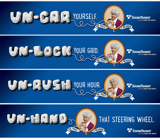
“The Voice of Reason” was a concept-driven campaign for Sound Transit, designed to challenge the frustrations of daily driving and position public transit as the smarter, more rational choice. Acting as a calm, commonsense counterpoint to chaotic commutes, the campaign used a series of “un” messages to encourage drivers to reconsider their habits and rethink their relationship with the road.
A key part of the campaign’s visual identity was its handcrafted typographic approach. I created and curated the custom “Knot-A-Font” typography, which became both inspiration and execution for the campaign, introducing a tactile, human quality that reinforced the authenticity of the message. I extended this concept through image creation and detailed photo manipulation, designing the campaign’s core visuals, including hands knitting the messaging, which were scaled across large-format applications.
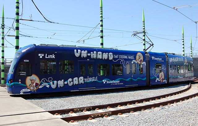
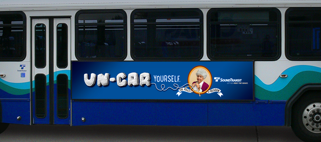
I also designed campaign executions across multiple touchpoints, including bus ads, light rail wraps, and airport baggage claim video screens, ensuring a cohesive and impactful presence across print, transit, and digital environments.